Glitz Beauty
Logo Design
Visual Identity
Brand Direction
Project Summary
GLiTZ is a modern beauty brand identity created to capture the essence of glamour, elegance, and confidence. The project focuses on developing a bold and memorable visual identity built around strong typography, sparkling star motifs, and a refined design system. The goal was to create branding that feels stylish and eye-catching while remaining clean and versatile enough to work across packaging, product mockups, and digital platforms. The final identity balances sophistication with personality, helping the brand stand out in the highly competitive beauty industry.
Applications Used
Adobe Illustrator
Adobe Illustrator
Adobe Photoshop
InDesign
What's the Problem?
The beauty industry is extremely saturated, with many brands using similar visual styles that make it difficult to stand out. The challenge was to create a distinctive and memorable brand identity that communicates luxury and confidence while still feeling modern and approachable.
The brand needed a logo that could feel bold, glamorous, and eye-catching, while also remaining flexible enough to work across packaging, digital media, and promotional materials.
Research & Inspiration
Before designing, I explored visual trends within the beauty and cosmetics industry to understand how successful brands communicate luxury and personality through typography and iconography.
I studied branding from modern cosmetic companies and noticed several common patterns:
• Bold typography that becomes the centerpiece of the brand
• Minimal but impactful color palettes
• Simple icons or symbols that reinforce brand personality
However, many brands felt overly minimal, which made them blend together. This inspired me to create something that felt more expressive and visually striking while still maintaining elegance.
The Process
Throughout the design process, the identity went through several iterations as I tested different logo structures, spacing adjustments, and color combinations. Some early concepts felt either too safe or too disconnected from the original brand, which helped guide the design toward a more balanced direction. By refining proportions, simplifying shapes, and improving visual hierarchy, the brand gradually evolved into a cohesive system that felt modern while still maintaining its original personality.

Main Logo

Alternate Logos


Brand Guidelines
To ensure consistency across all brand applications, I created a mini brand guidelines document that defines how the GLiTZ identity should be used across different platforms and materials.
The guidelines outline the core visual elements of the brand, including the logo system, typography, color palette, and star iconography. These rules help maintain a cohesive look whether the brand appears on packaging, social media, or promotional materials.
Application is no longer available.
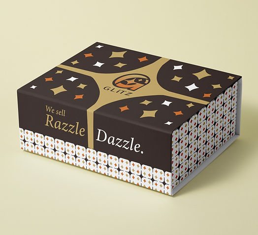
Glitz in Use...
Mockups & Visual Applications
To bring the GLiTZ brand identity to life, I created a series of realistic mockups that show how the branding would appear in real-world applications. These visuals help demonstrate how the logo, typography, and brand elements function beyond the design stage.
The mockups include product packaging and branded items that reflect how the identity could live within the beauty industry. Applying the logo to items such as cosmetic packaging and branded materials allowed me to test the flexibility of the design and ensure it maintained its strong visual presence across different surfaces and formats.