Funimation Rebrand
Logo Design
UI/UX Design
Branding/Identity
Product Design
Project Summary
The Funimation Rebrand is a conceptual branding project exploring what it would look like to bring the iconic anime brand back to life through small but meaningful design improvements. Rather than completely reinventing the brand, the goal was to refine it by improving the logo, color palette, and typography while keeping the spirit of Funimation recognizable to anime fans. I handled the entire project from concept to final presentation, creating a refreshed brand system and applying it across posters, streaming UI mockups, and merchandise using Adobe Illustrator and Photoshop.
Applications Used
Adobe Illustrator
Adobe Illustrator
Adobe Photoshop
Figma

What Is Funimation?
Funimation was a popular anime streaming platform that focused on English-dubbed anime and helped introduce many fans to series from Japan. In 2024, the platform officially shut down after its content and services were merged into Crunchyroll, marking the end of a service that many anime fans had used for years. Because Funimation was a platform I personally watched anime on, I wanted to revisit it through a creative lens. This project reimagines what the brand could look like if it were brought back today, exploring a modern visual identity and updated design system while paying tribute to a platform that played a big role in anime streaming.
Research & Inspiration
To inform the redesign, I looked at how modern entertainment and streaming platforms present themselves visually. Brands like Crunchyroll and Netflix helped establish a reference for bold, recognizable branding paired with clean digital interfaces. I also studied anime studio branding and promotional materials to understand how animation companies express energy and personality through simple visual elements. This research reinforced the idea that the strongest entertainment brands rely on clarity, bold shapes, and strong color systems.
Original Logo

Rebranded Logo
Alternate Logos

Main Logo


A Personal Connection
Anime has been a huge part of my life for years. I started watching anime when I was around 12 years old, and from that point on I never really looked back. What started as a casual interest quickly turned into something that shaped a lot of my creative inspiration, from storytelling to visual style. Platforms like Funimation were a big part of that experience, giving me access to the shows that pulled me into the world of anime in the first place. In a way, this project feels like saying goodbye to an old friend. Reimagining the Funimation brand gave me the chance to celebrate something that meant a lot to me growing up while using design to give it one last spotlight.
The Process
Throughout the design process, the identity went through several iterations as I tested different logo structures, spacing adjustments, and color combinations. Some early concepts felt either too safe or too disconnected from the original brand, which helped guide the design toward a more balanced direction. By refining proportions, simplifying shapes, and improving visual hierarchy, the brand gradually evolved into a cohesive system that felt modern while still maintaining its original personality.


Almost Finished...
Final Outcome
The final result is a refreshed Funimation brand identity that feels more modern, intentional, and visually cohesive. The updated logo acts as the foundation of the system, supported by a refined color palette, strong typography, and animation-inspired graphic elements. To demonstrate how the brand could exist in real-world applications, the identity was applied to streaming platform interfaces, anime promotional posters, and branded merchandise.


Advertising
Streaming Service


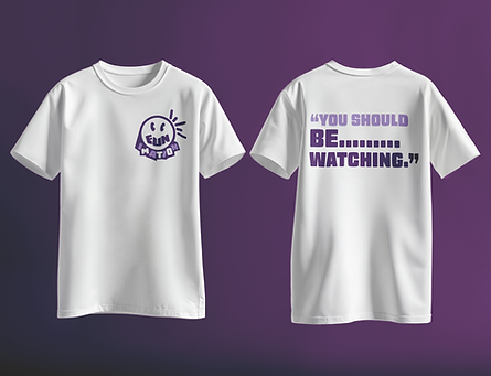
Merchandise
This rebrand also includes merchandise to show how the brand could extend beyond the streaming platform itself. Anime communities often connect with brands through apparel, collectibles, and other merchandise, so it felt natural to explore how the new identity would translate onto real products. Designing items like hoodies, shirts, and accessories allowed me to test the flexibility of the logo and visual system while imagining how fans might interact with the brand in their everyday lives.